Product Update February 2019
We're constantly tweaking the HunchBuzz user experience and probably you don't even notice the small incremental changes (except maybe subconsciously thinking "HunchBuzz is so easy to use!"). We've been working on some important design elements over the last couple of months for the both the web and mobile apps, and they are released this week.
Here's what you may (or may not) have noticed:
Web app
Idea page
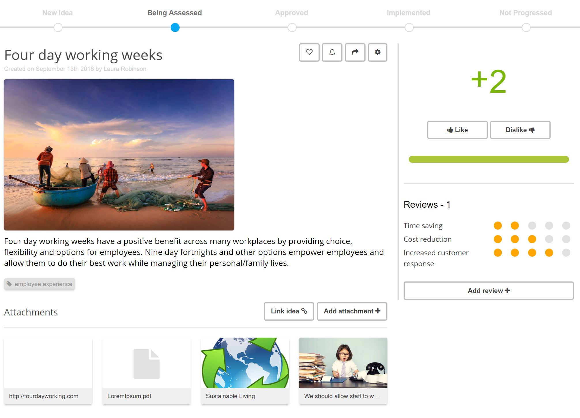
The idea page is probably where users spend the most time. It went through a major upgrade last year when we re-skinned the app. Now we've done a thorough review and re-design to bring the core elements to the fore and present your ideas in a much more beautiful way. All the information you rely on is still there, it's just presented differently, in what we hope is a much more intuitive way.

You'll notice attachments and linked ideas have been consolidated into one panel. It makes sense to treat them the same, they're both artifacts to provide more context to an idea.
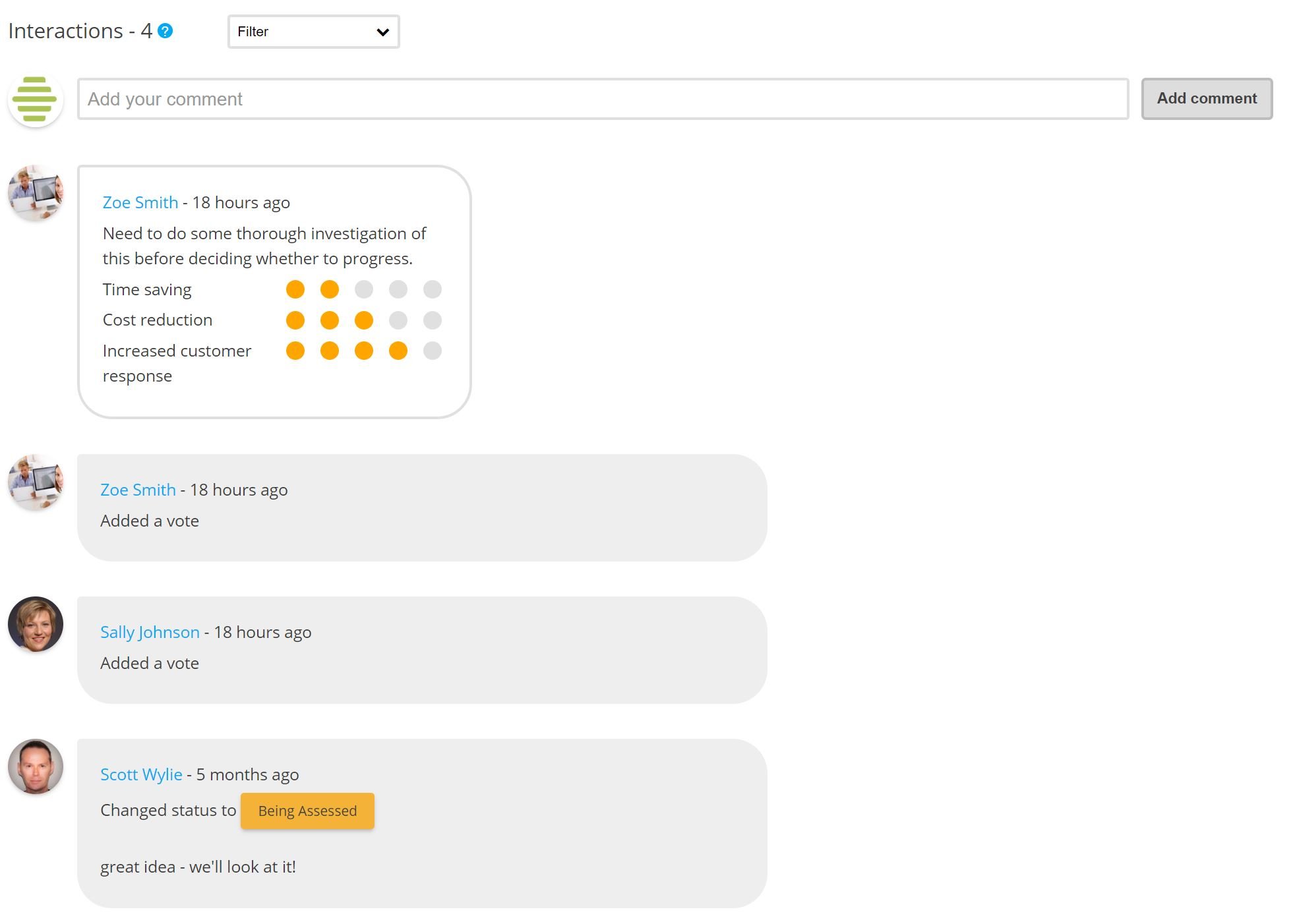
Activity stream
The activity stream is more spacious and readable allowing you to filter on various interactions types - very handy for long streams.

Navigation
It's now easy to scroll through ideas within a challenge, and to return to the challenge itself.

Journey page
The Journey page (it might be called something else in your platform) presents a lot of information so we've smartened it up to make it more consumable (stay tuned for more improvements for this page).

General changes
You might notice some more subtle changes like lighter button styles, our new logo and many other small improvements.

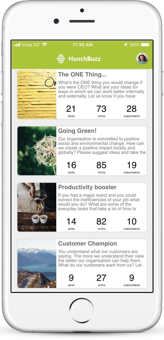
Mobile app
We've applied the same thinking to the mobile app. Browsing through ideas and voting is the most common use case for the app and navigating between ideas is now much easier, simply swipe left or right (or hit the navigation buttons) to scroll between ideas within a challenge.

More info at the Help Center
Keep on innovating!
The HunchBuzz Team