New Visualization Tools

Today we're adding new visualization tools to help you navigate challenges and ideas in an intuitive and fun way. They are simple, interactive charts that let you explore HunchBuzz graphically - and maybe uncover patterns and activity you haven't seen before.
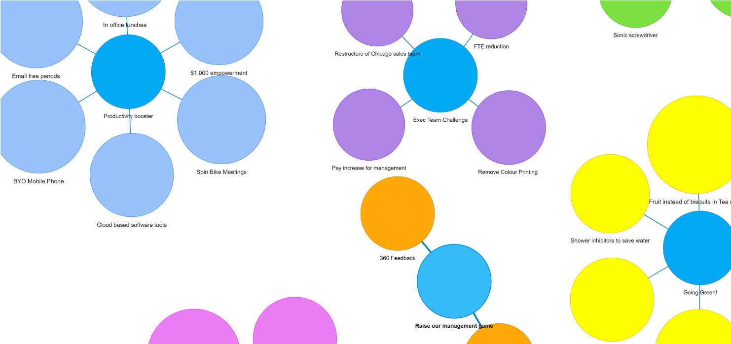
Popular ideas
Now you can view the most popular ideas at a glance on the admin dashboard. The new Popular ideas panel displays an interactive bubble chart showing the relative activity across the top ideas. Use your mouse scroll wheel to zoom in,explore and play with the ideas. Click the Enlarge button to zoom out for more screen real estate.
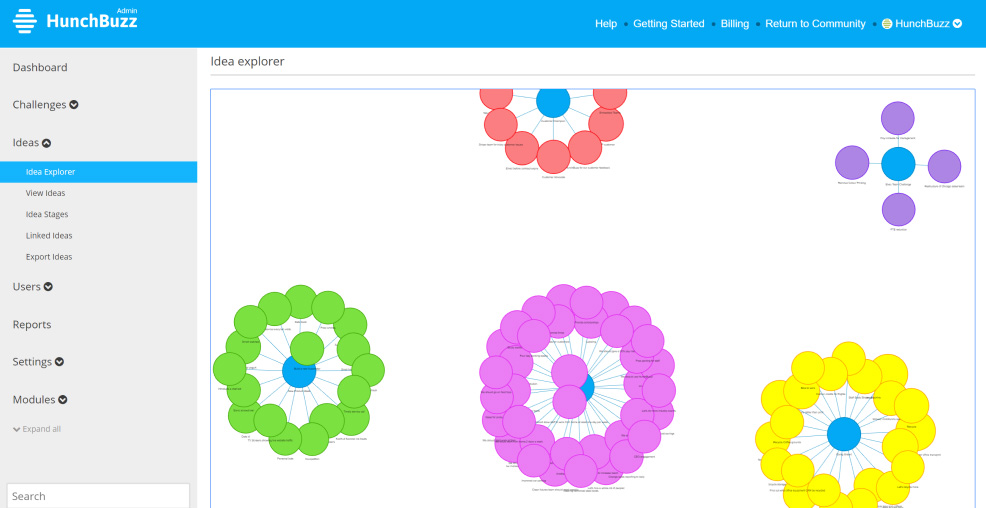
Idea Explorer
If you want to explore all ideas across HunchBuzz navigate to Admin->Ideas->Idea explorer to see all active ideas in one place at one time. Of course it's also interactive so you can zoom, drill down and click any idea to view it in full.
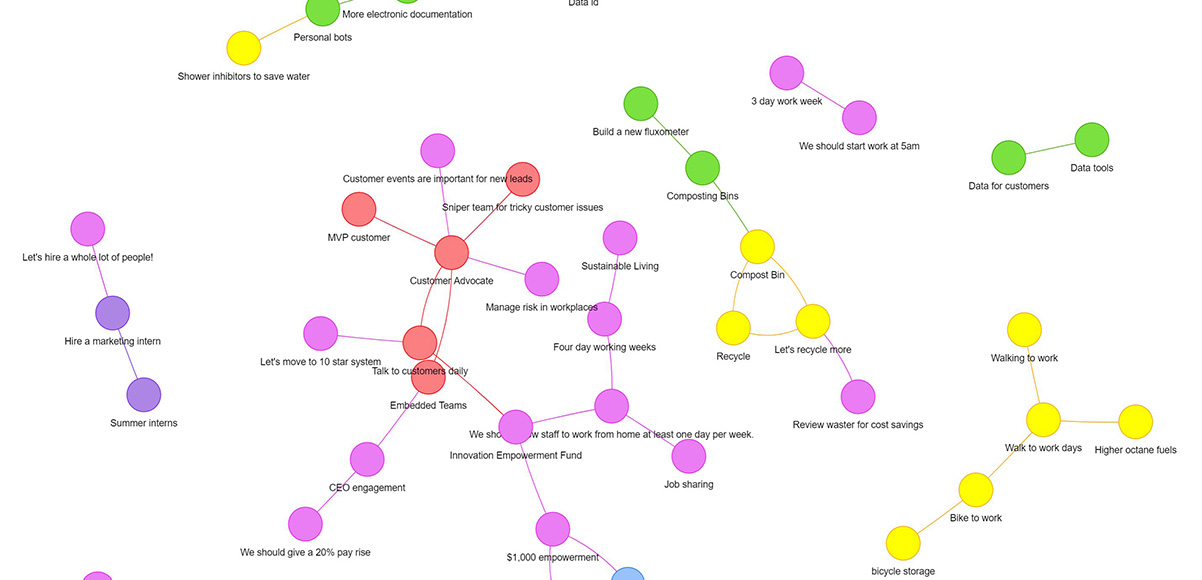
Linked ideas
A customer recently asked how they could view all linked ideas across their platform. Our new Linked Ideas Viewer offers just that functionality. Go to Admin->Ideas->Linked ideas to see the chains of linked ideas. Ideas are color-coded by challenge to make it easy to see where they belong.
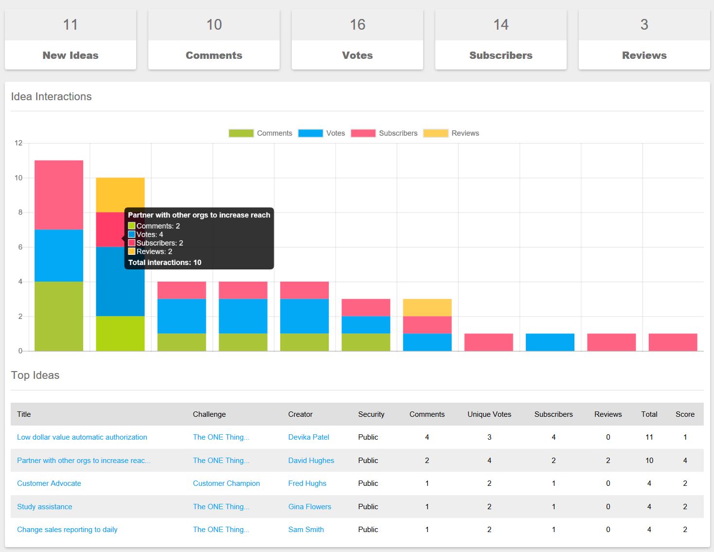
Trending report
Don't forget you can see a super detailed view of ideas and challenges in the Trending report. You can also export the data from your report for further analysis.
Keep on innovating!
The HunchBuzz Team